There’s a lot of talk out there about the national debt and who is to blame for creating it and who will get credit for fixing it. We can be sure the president will take credit for fixing it. True to form, he is blaming Bush for creating it. You haven’t heard that? Well take a look at this graph from Whitehouse.gov:

Even the liberal friend who pointed me to it said that it was a bit disingenuous in how it pins spending on Bush that happened during the Obama administration. They call them lies when a Republican does it.
That got me looking around for other graphs about the national debt. How about this one from saintpetersblog.com:

This one ties increases to the debt to presidents. Notice that there is no mention about who is running the House of Representatives at the time. It conveniently stops before Obama took office.
Those first two were obviously written by Democrats. Here is one that is a little more balances in that it shows the make up of the federal government at the time and percentage changes. It still leans Republican in that it does not use real dollars and compare the change to the S&P 500 as if that has any place in the debate. It also includes the Obama years so far.

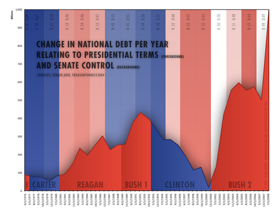
Here’s a funny one from democrashield.com:

This one ties the debt to the President and the Senate and completely ignores the branch of government that is in charge of spending.
Finally, I think this graph is the most balanced and the one that matters most:

That looks bad. Now if you consider that only half of the adults in the US pay any income tax (http://www.msnbc.msn.com/id/36226444/ns/business-personal_finance/t/half-us-pays-no-federal-income-tax/) and you can double the totals on the graph’s left to tell you how much taxpayers will have to pay back eventually. Raising taxes (income enhancement to Democrats) isn’t going to get us close to getting this problem under control. The balanced approach is a shame designed to help the half that do not pay income tax.


